Been a couple of questions about flags flying around (why waste a good pun), so I thought I'd do a step by step guide to the approach I have. Walter's an expert with the computer but I went the old fashioned way (well I don't have photoshop) and painted all mine. It's a compromise between mediums - paint and foil offer modeling possibilities at the expense of image clarity - paper flags touched up with paint offer much sharper images but the flag is stiffer. Either way our flags have been getting a lot of great feedback so thanks to everyone.
First up - flags may be made from symetrical polygons of material but unless you plan to plant it on the moon it will never stand completely proud from the pole, even in a strong wind. This is due to the cumulative weight of material working with gravity. Next time your out have a look - all flags drag/droop yet on the wargame's table most flags look like Neil Armstrong's!
In both methods we skew the image to get a false drop, which goes a long way to mimicking this effect. On the computer this is relatively straight-forward but on foil....read on.
Most of the Covenanter Regiments at Auldearn are poorly known, with little, if any info on their banners. So within the realms of reason I've tried to come up with sigils that are tied to the local clans, lairds or use common national symbols.
I start by drawing these on the non-deformed polygon and grid it up so I have a guide when drawing it on the foil.

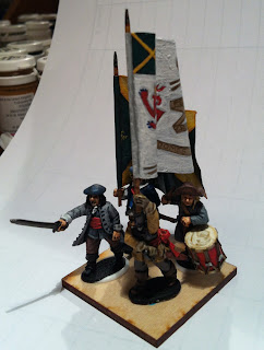
These are the Colonel's Colour's for Findlatter's and Buchanan's - I'll write up why I chose the designs and colour when I write up the regiments.

I prep the foil carefully, smooth it and prime it with white paint - this allows a surface which cnd be drawn on and to which the paint will adhere. The whole grid is slid to get the drop, so everything stays in the same relative place - making for a slightly out of shape image on the detailed parts (see the lion). Drawing on the foil leaves grooves - be aware when applying the paint - and be careful in the final stages (see later).

Here's the Regimental standard - a dropped saltire - no text is done at this stage.

As with the troops, I build up the colour's by layering. Key here is to get good edge definition and make sure it is a dark edge (so in effect you work inwards).

Keep the lines sharp - go back and touch up if necessary - keeping it neat. This saves a lot of work later on.

Second layer - brings out the definition on the scrolls, again keeping it neat is important. Leave the crease's round the pole!

Saltires start to come to life - wee bit darker around the edges of the block colour's helps sharpen the edge effects.

Final layer - now you see the white - making it a wee bit streaky rather than solid flat will help with the texture. Additional, highlight's can be applied to bring out subtle details. Painting the text is a bear, but a steady hand and the ability to go back and touch up make it ok. Don't be afraid to paint over the whole text and do it again.

At this point I'm usually wishing they had just used that traditional slogan of "F*#k the Pope". Again the neater the better, dont seat it if it's squint though - it all gets bent again when its folded so you don't notice it too much in the end.
At this point, turn the foil over and use a spoon to smooth out all the indents made when you drew the design. as the paint is thick and still somewhat flexible it heal's well.
Turn it over and apply a layer of varnish - this seals the paint - I use an old bootle of armory matt varnish (which looks more satin) but this helps keep the paint in good condition - the whole thing gets dull-coated down anyways.

Mount the flags on the poles. Make sure the whole face is glued - normal wood glue works best. Pay attention to the staff seams and spend time smoothing out out. Already you can see the drop - looks more flag than square now.
At this point go round the edges and touch up the paint - I cut with a knife rather than scissors, using a metal straight edge. It's sharp but you still end up seeing the foil. If you have big overlaps trim with a scissor. I see so many good flags (Little Big Man in particular) ruined by silver edges. It only takes two minutes.
Pay attention to the staffs, especially at the flag staff join. Key thing here is that Civil War flags where on short poles, so cut them down. The ensigns waved them about one handed - so its not the pole you have outside your local hotel!
Before you mount it on your standard bearer do the folds. I uses a brush handle and fold the flag round it. Keep the folds smooth and curved - this stops the paint cracking. I like to fold at and angle but you can play with this and also with the squeeze to control the tightness.

So here's the finished article. Even though the figures are done - don't stick them down until you have played with the vertical space. Also remember, the pike block is behind you, so of its pikes at the ready get your command base sorted then fit your pikes around it.


All the photos where done with the phone so not the best. However, you can see that the folds and the drop now combine to hide the worst of the painting gaffs.


